When we all started formal classroom education, we were made to believe that the true size of the world are those projections on the spherical object, described as the map of the world.
This image of the world has been in our minds, and has now found a comfortable place in our memory. The famous American Writer and Futurist, Alvin Toffler was once quoted as saying: “The illiterate of the 21st century will not be those who cannot read and write, but those who cannot learn, unlearn, and relearn.”
True to Mr Toffler’s words, we have to learn, unlearn and relearn the image of the map of the world in our minds. The school system seems to have nicely packaged many lies in deep within our psyche.
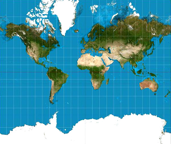
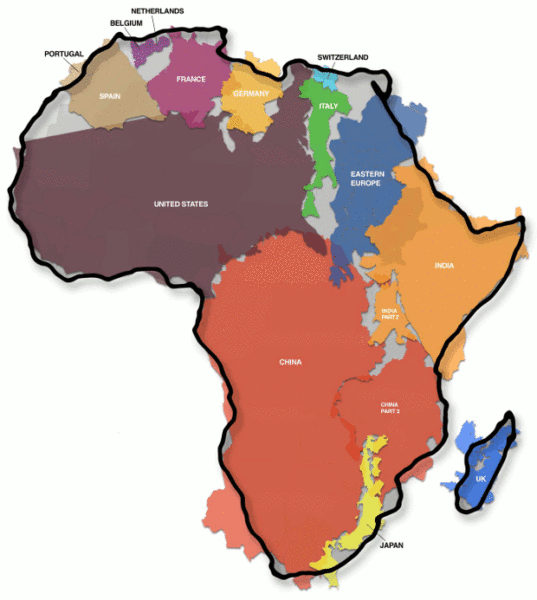
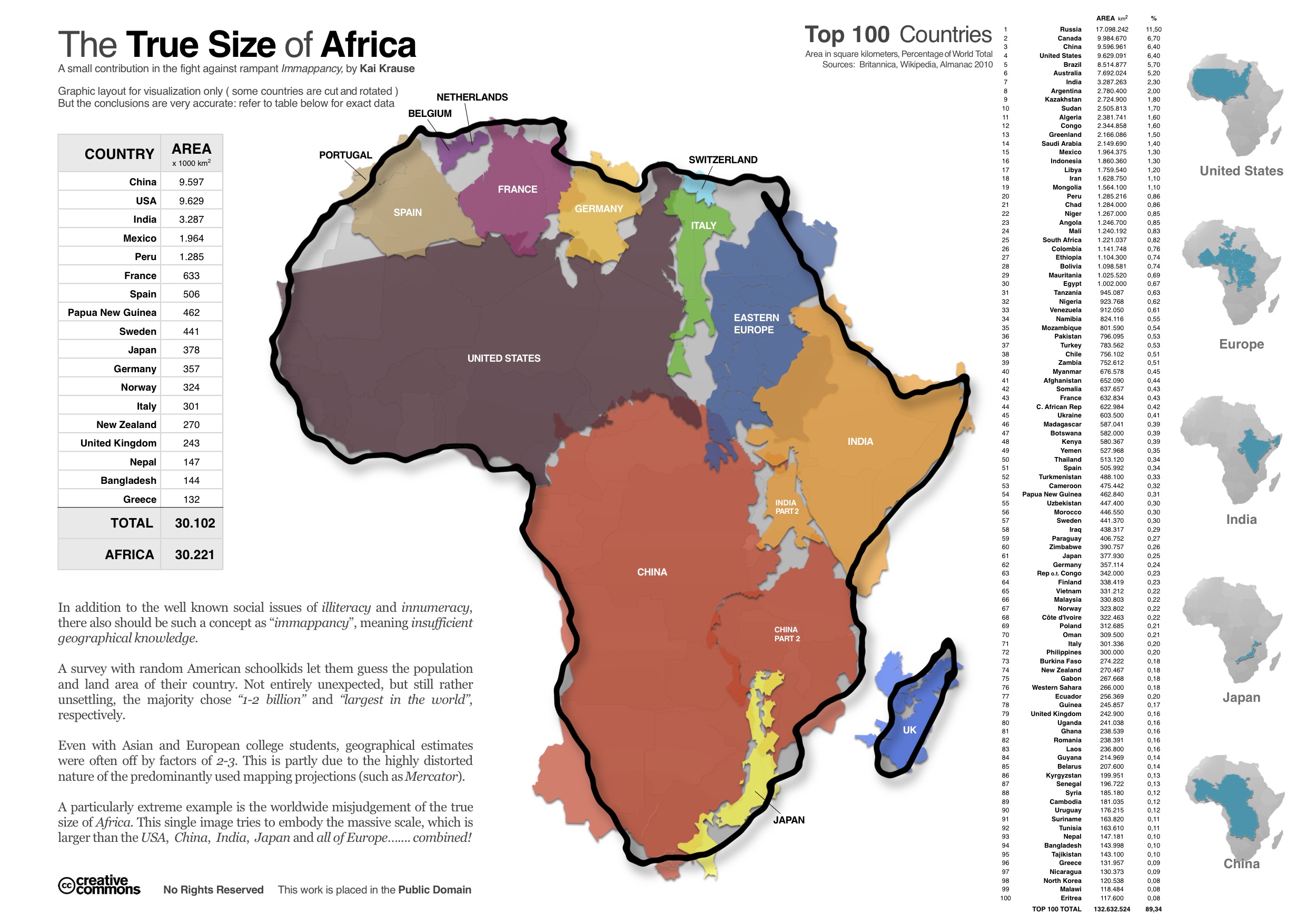
In October 2010, the German Computer Software Wizard, Kai Krause stirred a huge controversy in the West with a map entitled “The True Size of Africa.” Krause’s map showed that Western cartographers, led by Gerardus Mercator, distorted the relative sizes of countries and continents. Krause revealed that the continent of Africa was unfairly reduced in size by Mercator. It is said Mercator made the projection of the world in 1569, for the use by navigators on the high seas. His invention was helpful for sailors, but not something that was intended to represent the real world.
When Krause made these revelations, some Western cartographers said a sphere cannot be represented on a flat plane without distortion, admitting that all map projections distort in one way or another.
However, the significant aspect of Krause’s work, which was to show how Africa has been unfairly reduced on the map in size, never gained attention in the Western media. But now, the debate has resurrected again, and the International Cartographic Association (ICA) has added its voice to the debate.
CNN, who started this current debate about the true size of Africa, writes: “on a typical world map, Canada is a vast nation. Home to six time zones, its endless plains spread from ocean to ocean, dominating great swathes of the northern half of the globe. But, in reality, three Canadas would comfortably fit inside Africa. Our world map is wildly misleading.”
When the question on the distortion of the world map was put to the ICA president, Professor Menno-Jan Kraak, he didn’t deny it. He told CNN: “Somehow this map projection came to be used on most world maps, especially those produced for classrooms since the beginning of the 1900s. Most of us have grown up with this world image.”
Professor Kraak adamantly argued that the map of the world we see today is nothing more than a propaganda tool. Using Russia as an example, Kraak said “If you take the Mercator projection, where Russia looks huge, give it a bright red color and then compare it to the rest of Europe, you see how dangerous it can look.”
According to historians, Mercator initially made globes; when he was transferring his map from a three-dimensional curved surface to a flat sheet of paper, he reportedly faced a serious challenge. He is said to have taken the equator as the logical map center and left it big, confusing gaps near the poles. When Mercator realized the mistake, he stretched out the northern and southern extremities of the globe to fill those gaps, producing an elegant and usable map. For high seas navigators, it was a brilliant map, but the truth is, Mercator’s projection distorted the relative size of the continents, to the advantage of the West, and the repercussions of this are still being felt today.
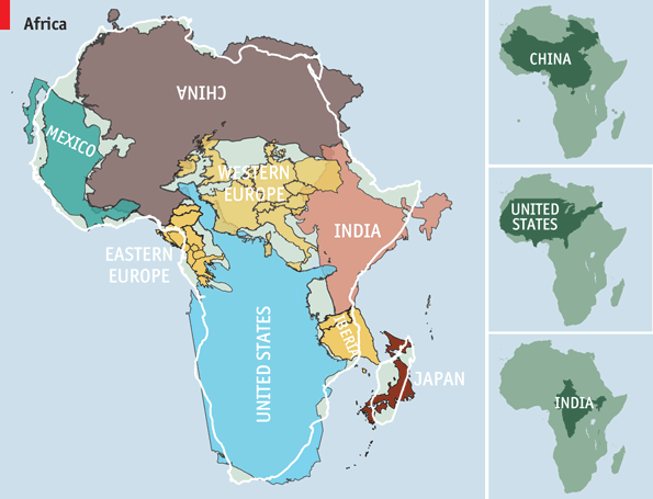
Canada, Russia, the United States and Europe are greatly enlarged, while Africa has been significant reduced. On the Mercator map, Greenland looks almost the same size as the whole of Africa, but in truth, Greenland is no bigger than the Democratic Republic of the Congo, a country in Central Africa.
Professor Kraak believed the enlargement of Europe and North America is not an accident, but a clear case of bias against Africa.
Marianne Franklin, a professor of Global Media and Politics at Goldsmith’s University of London said the map we see today was made to display the power of the West as the ruler of the world, during the era of European Imperialism.
“The term ‘power of representation and representation of power’ sums up quite well how maps and the rise of the Western nation-state system, and with that, empire and colonialism are linked. The world maps that prevail today have been embedded in Western imaginations since the British Empire. They continue (to prevail) despite many challenges to their fairness and accuracy because they underpin the ongoing Anglo-Euro-American presumption that the world belongs to them, and pivots around these geo-cultural axes,” professor Marianne said.
Professor Kraak closed the debate, saying there is no such thing as a perfect map. According to Kraak, the earth is a sphere, more of a potato-shape. And it is in fact, impossible to map it on a flat surface without errors in proportion.
This article (ICA Finally Admits World Map is a Propaganda Tool for Power, Western Cartographers Deliberately Shrunk Africa) is a free and open source.